About Responsive Web Sites
Mobile web browsing has increased by 300% in the last three years. With over 1.2 billion (and counting) mobile users worldwide, can you afford to not serve a responsive website that adapts to their device?
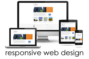
We are designing sites to be viewed on desktop computers, tablets and smart phones. These sites have to be responsive and work well on these devices, so the user has a seamless experience. We design future-proof RESPONSIVE web sites — like this one!
Is your current site responsive?
How does your current site stack up on a Smart Phone or iPad? Does it resize to fit the screen perfectly? Or is the right hand side of the page out of view? To test your site, type your current web address into MobileTest.me.
PLEASE CONTACT US to discuss how we can help get you into a SMART PHONE SAVVY WEB SITE, and make sure your site always look good on any size screen!
Click here to read more about web site designs.